RGB vs CMYK: why colours change between screen and paper
Screens make colour with light, printers make it with ink. Here is what that means for your photos, and how to avoid surprises.
By the Studio6 min read

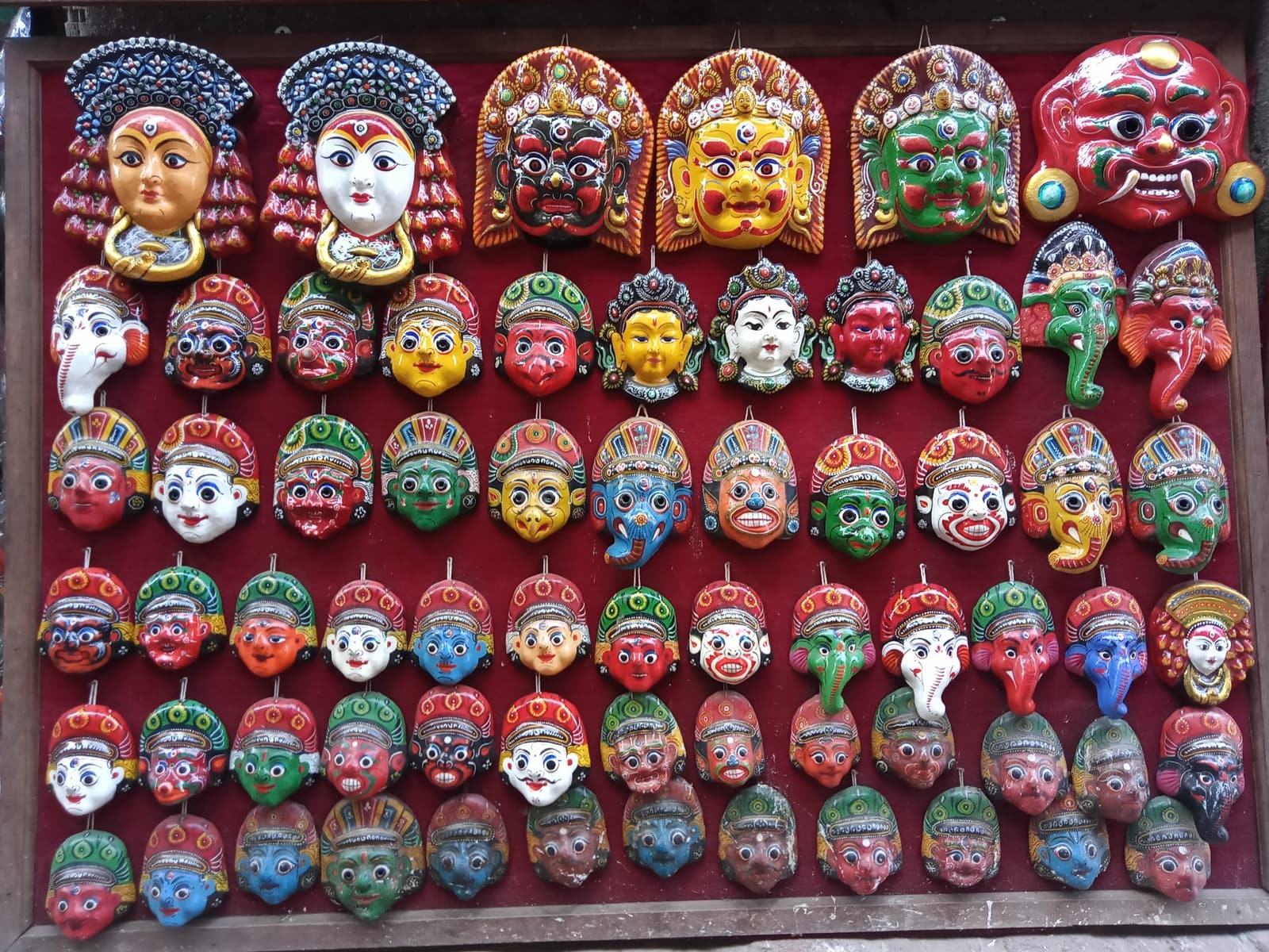
Think of the colour powders sold before a festival: a heap of deep magenta, a bright yellow, a green so vivid it almost hums. Now imagine recreating that bowl using only four inks on paper. Most of it translates perfectly. Some of it, especially the electric pinks and greens, cannot be matched exactly. That gap between what a screen can show and what ink can print is the whole story of RGB and CMYK.
What is the difference between RGB and CMYK?
RGB stands for red, green and blue. Screens mix these three colours of light to make everything you see, and adding more light makes colours brighter, up to pure white. CMYK stands for cyan, magenta, yellow and key, which is black. Printers lay these four inks on paper, and adding more ink makes colours darker. Because one system adds light and the other absorbs it, they cannot produce exactly the same range of colours.
Which colours change the most in print?
The colours most likely to shift are the ones screens are best at: neon greens, saturated electric blues, hot pinks and bright oranges. On paper they come out a little calmer. Skin tones, skies, stone, wood and most natural scenes print very faithfully, which is good news for nearly every photobook.
Do I need to convert my photos to CMYK?
No. For photobooks, send your photos in RGB, the way your phone or camera saved them. Professional photo printing workflows handle the conversion with colour profiles tuned to the exact paper and press. Converting yourself with a generic profile often makes things worse, because your conversion and the printer's settings will not match.
Why does my screen look different from the print?
Most phone and laptop screens are brighter and more saturated than paper can ever be, and many shift colour automatically through night modes or adaptive brightness. Paper also reflects room light instead of glowing, so it always looks a little quieter. A print is not wrong for looking softer than your phone. It is just honest.
How to get colours you will be happy with
- Turn off night mode and blue light filters while editing your photos.
- Set your screen brightness to around the middle, not maximum. A blazing screen makes you edit photos too dark.
- Avoid pushing saturation sliders to the edge. Moderate edits survive printing far better than extreme ones.
- Keep the colour look consistent across a book. Warm photos next to cool ones look more jarring on paper than on a screen.
- Expect matte and uncoated papers to soften colour a little more than silk. That softness is part of their charm.
What about black and white photos?
Black and white photos print beautifully, but check that they are truly neutral. A photo converted on a phone can carry a faint colour tint that becomes obvious on paper, especially next to other black and white images. Most editing apps have a saturation slider: pull it all the way down for a clean, neutral result.
The short version
Edit in RGB, keep your adjustments gentle, and trust the print to be a little calmer than your screen. The colours that matter most in a family photobook, faces, skies and the light of a good day, travel from screen to paper beautifully.