Choosing fonts for your photobook
The right typeface can elevate your photobook from a simple album to a polished keepsake.
By the Studio6 min read
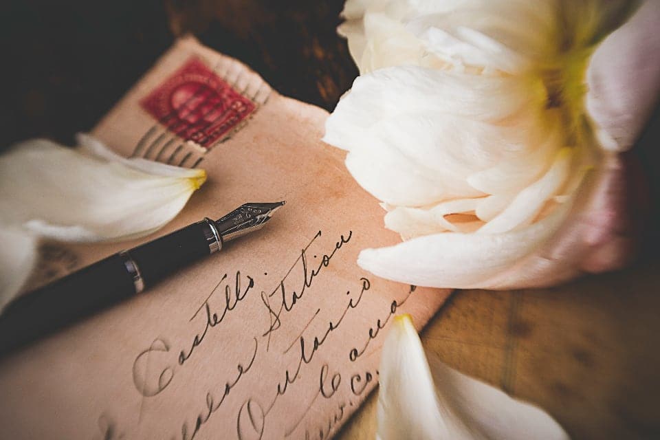
Type is the quiet partner in a photobook. When it is right, nobody notices it; the book just feels polished. When it is wrong, it pulls attention away from the photos and makes the whole book feel homemade in the wrong way. A few simple choices are enough to get it right.
How many fonts should a photobook use?
Two at most. One for titles and one for captions and longer text is a classic combination. Many beautiful books use a single typeface in different sizes and weights. Every extra font adds visual noise, and photos need the reader's full attention.
Serif or sans serif?
Serif fonts have small strokes at the ends of letters. They feel classic, warm and literary, and they suit weddings, family histories, anniversary books and anything with a sense of tradition. Sans serif fonts are cleaner and more modern. They suit travel books, portfolios, business books and anything with a contemporary feel.
A popular pairing is a serif for titles and a sans serif for captions, or the other way round. The contrast helps readers tell the two apart at a glance.
Should I use script or handwriting fonts?
Sparingly, if at all. Script fonts are hard to read at small sizes and can quickly look like a greeting card. If you want a handwritten feel, consider using real handwriting instead: a scanned note, a signature, a short message written by someone in the book. Real handwriting is always more moving than an imitation.
What size should captions be?
Captions are usually comfortable at about the size of text in a printed magazine, smaller than body text in a novel but still easy to read without effort. Titles can be much larger. The contrast between a very large title and small, quiet captions is one of the things that makes a book look designed.
How do I keep text readable over photos?
Place text over the calmest part of the image, such as sky, a wall or a dark shadow. Use white text on dark areas and dark text on light ones. If the background is busy, move the text beside the photo instead. Readability always beats cleverness.
Should text be centred or aligned left?
Left aligned text is easier to read in captions and paragraphs, because each line starts at the same place. Centred text works well for short titles, dedications and quotes. Mixing alignments on the same page usually looks messy; pick one approach per page and stick to it.
Does Soouvenir choose fonts for me?
Every layout comes with a pairing chosen by editorial designers, so you can start with something that already works. You can change it, but if you are unsure, the default pairing is a safe and elegant choice.
A final check
Print a test page or view it at actual size before ordering. Text that looks fine on a large screen can be too small or too large on paper. Read a caption out loud: if you stumble because of the font, choose a simpler one.